Branded Newspaper Ads
Unified Visual Language
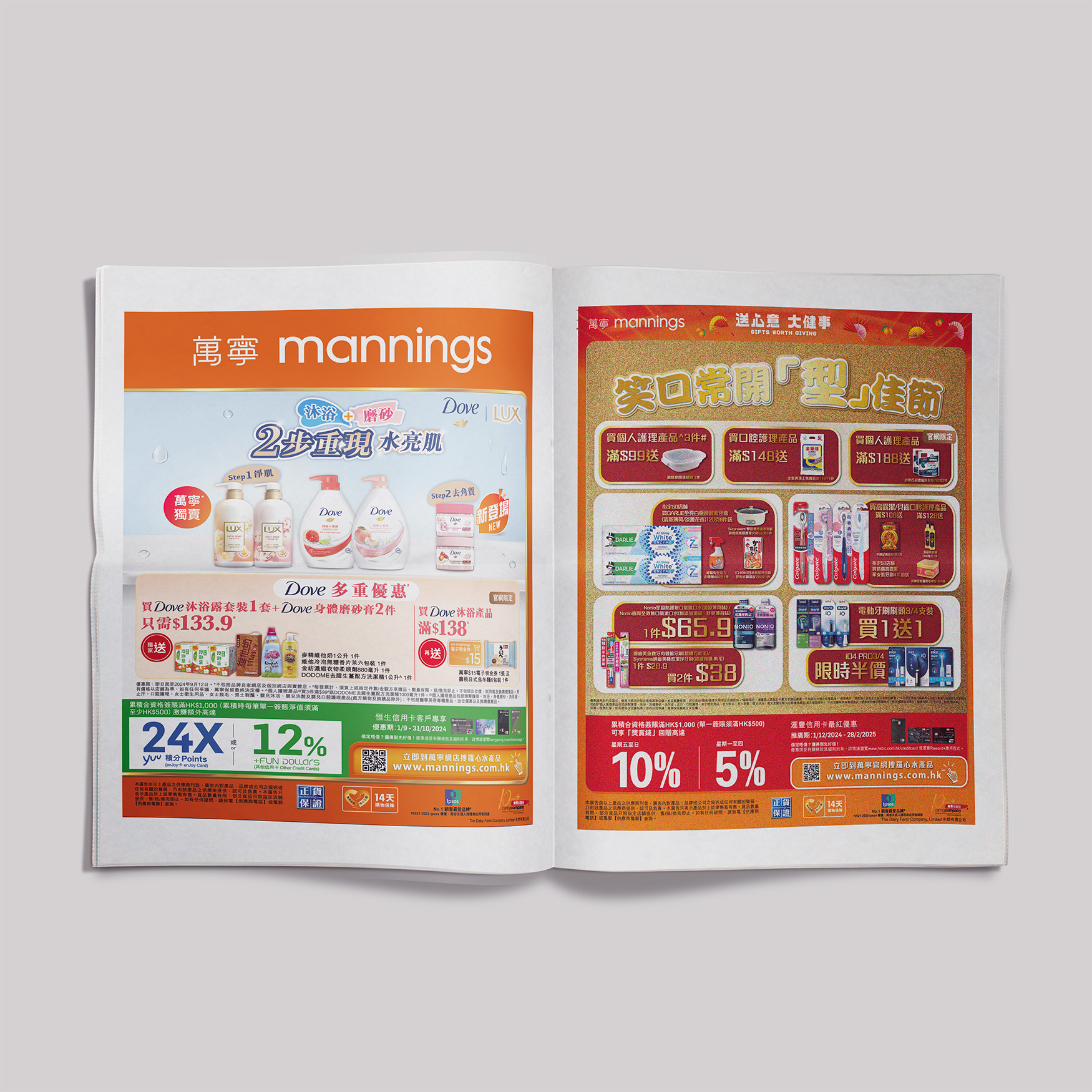
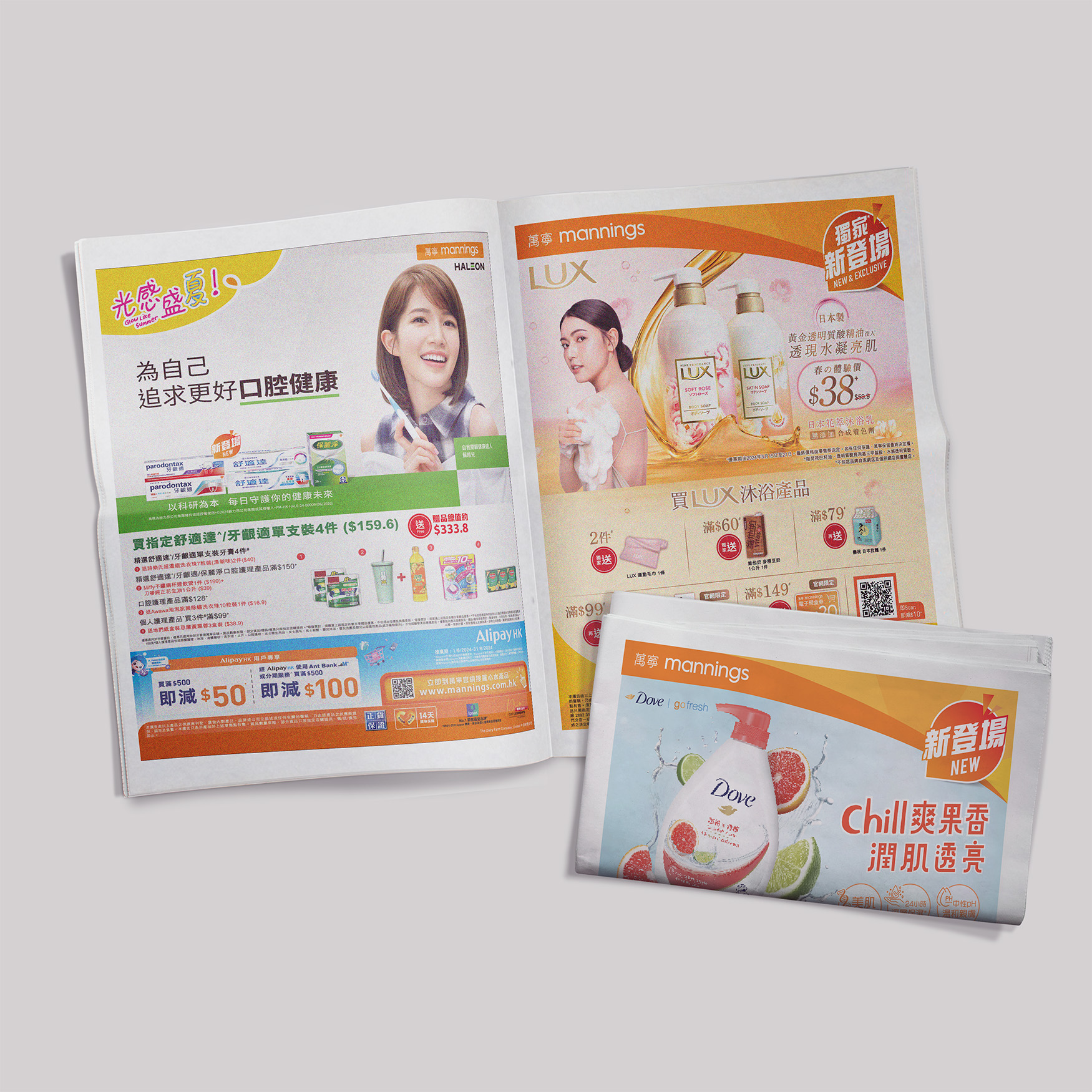
為了提升廣告的整體辨識度與閱讀效率,我以萬寧橙為基礎色統領整體版面,搭配清透水感主圖呼應「保濕」訴求,並以圖文分欄方式呈現產品資訊與優惠細節。版面設計考慮到報紙閱讀習慣,利用對齊、留白與視覺流線,確保消費者能快速掌握重點。此手法有效整合品牌視覺語言與促銷訊息,強化品牌印象。 To reinforce brand recognition and ensure reader efficiency, the layout centers around Manning’s signature orange and water-themed imagery to echo the hydration message. A structured column layout separates promotional details from visuals, while alignment, spacing, and flow guide the reader naturally through key information. This cohesive approach enhances both brand identity and message clarity within the constraints of print media.
Promotional Strategy Within Print Constraints
針對報紙媒體的特性,本案以資訊密度高、圖文並重的策略為核心,將複數優惠分區排列,以利不同客層迅速定位所需。考量報紙印刷精細度,我優化圖片對比與字體粗度,確保即使在非專業光源下亦具可讀性。整體設計強調「資訊效率」與「促銷誘因」,有效轉化視覺流量為實際購買行動。 Tailored for the nature of print media, this design adopts a high-density, image-text hybrid strategy to deliver multiple offers clearly. Segmented layouts help readers quickly identify relevant deals, while enhanced image contrast and bold typography ensure readability even under suboptimal lighting. The approach maximizes informational efficiency and purchase motivation, translating visibility into action.