Playful Snack Visuals
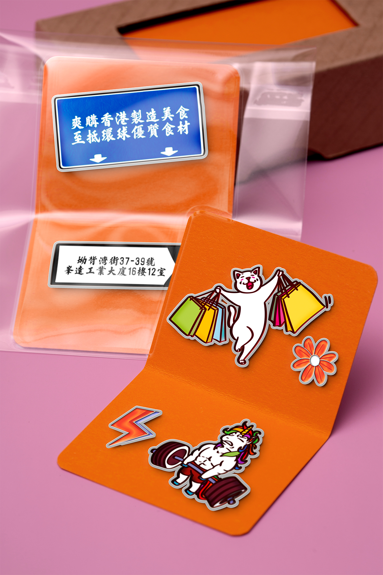
這是一組將懷舊零食包裝文化轉化為視覺設計語言的實驗計畫。從LetEatGo的品牌概念出發,我嘗試以一種輕鬆幽默的方式解構我們日常習以為常的「零食視覺」,重新編排圖像語彙,打造出一套「可以收藏的視覺記憶」。
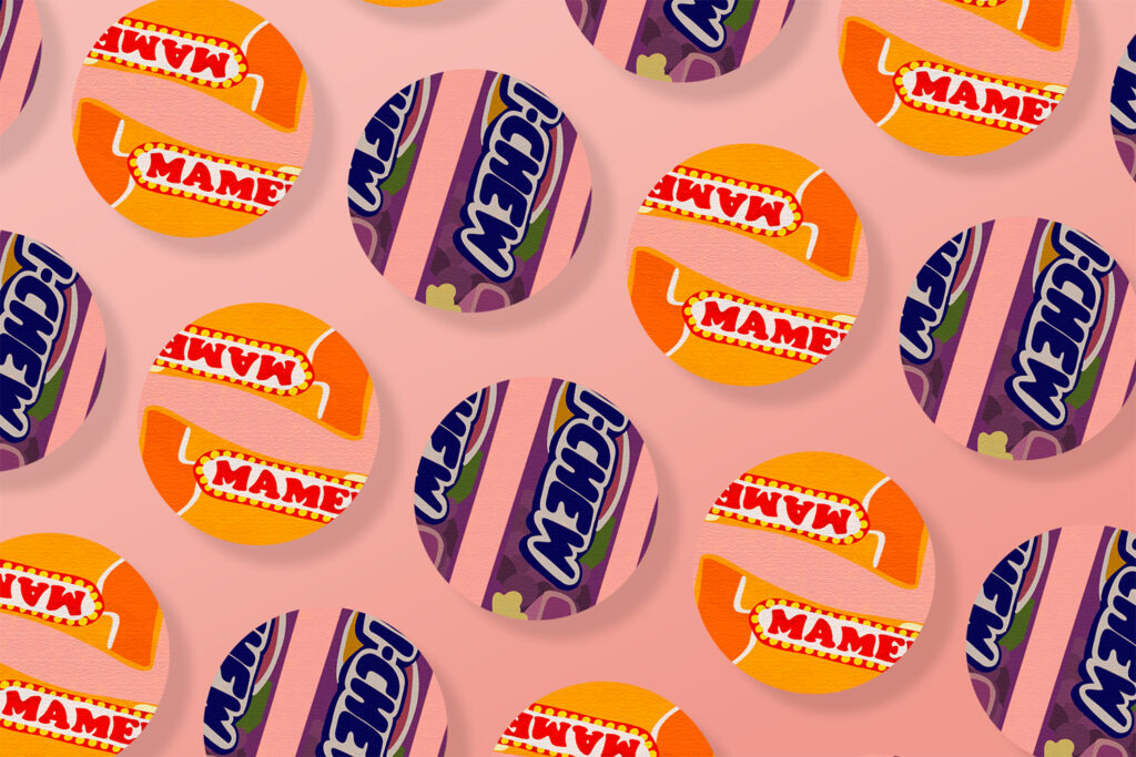
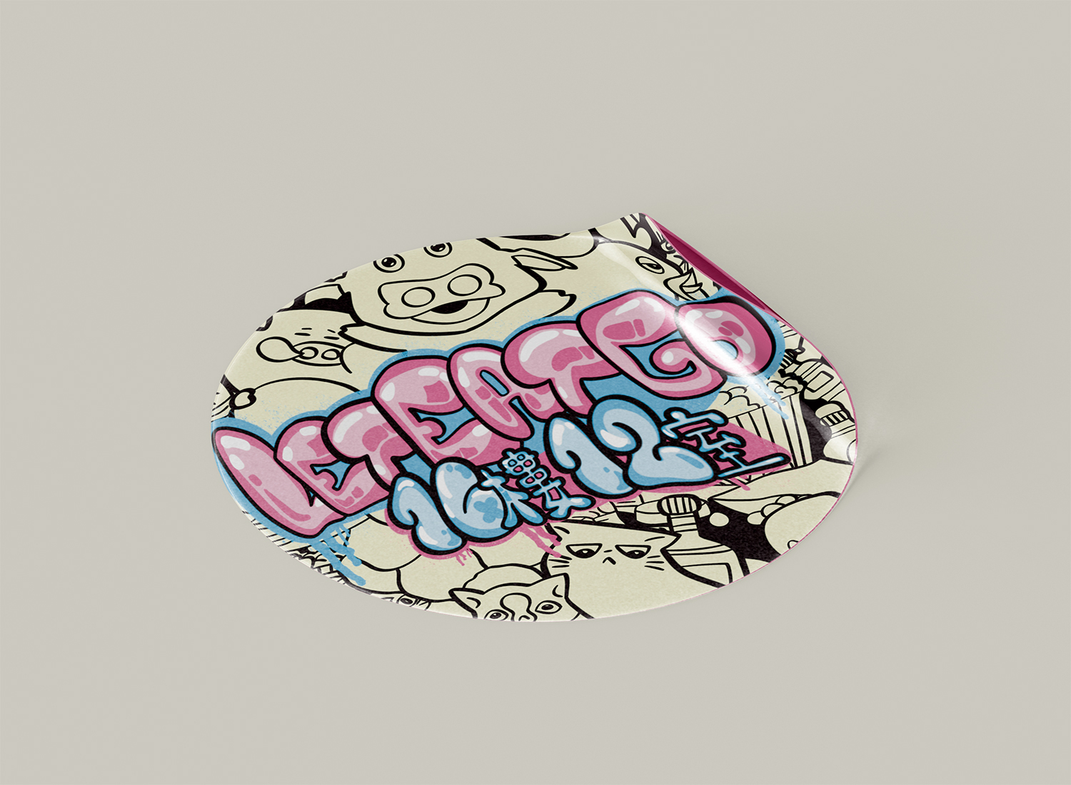
設計靈感來自香港街頭便利店、塑膠包裝袋上的字型風格、地道零食角色、街牌、卡通與日常塵囂。插畫採用強烈的色塊與粗手繪筆觸,讓每一枚貼紙與扣針都像是你童年時代某個角落的切片。
本系列作品不僅是一套商品原型,也是一種視覺文化的再詮釋——將記憶中的味道與圖像,透過設計再次打包、重組、幽默化,轉化為一套輕便卻富意義的品牌語言。
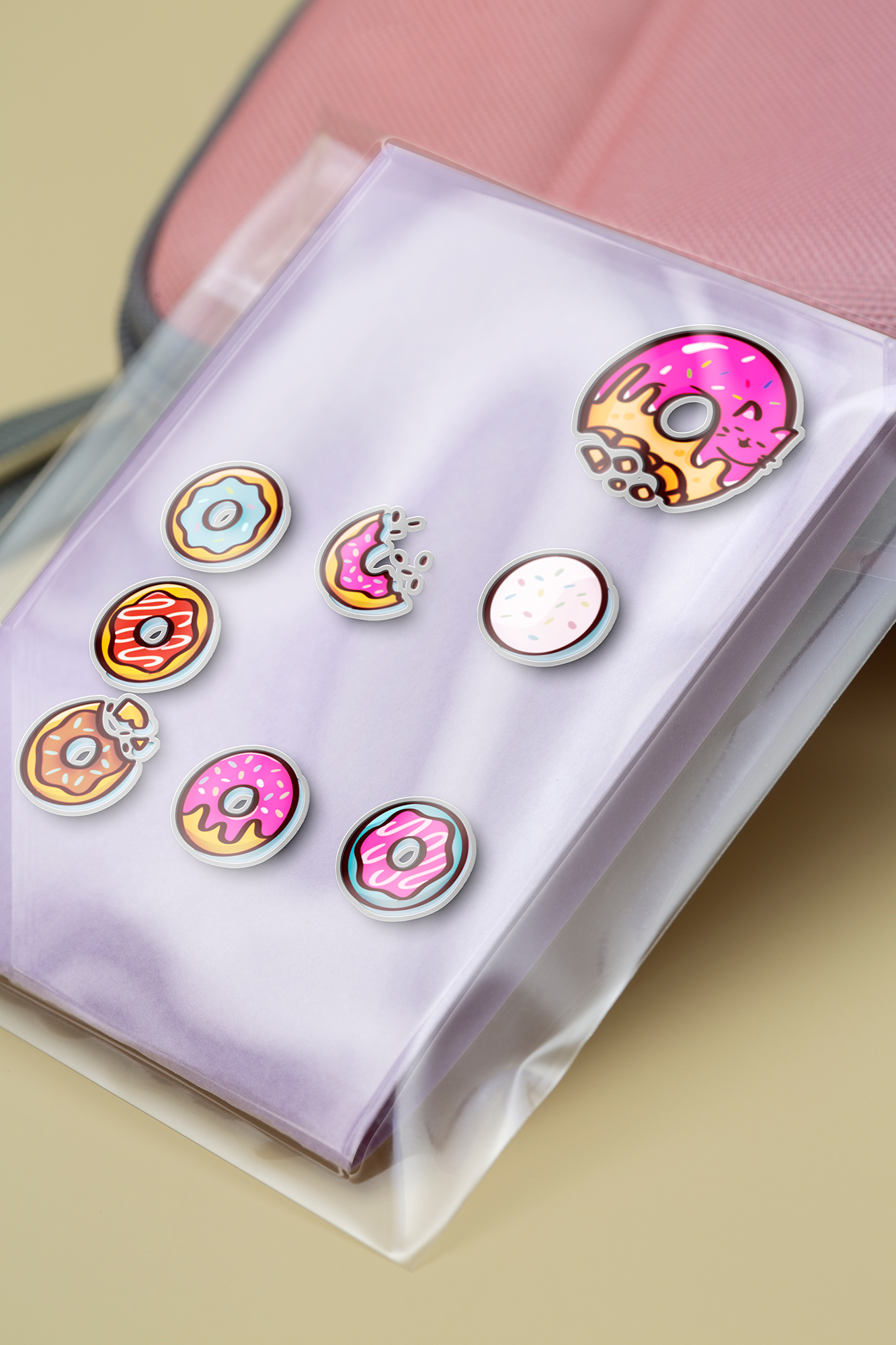
This project explores the nostalgic visuals of Hong Kong snack packaging through a playful, illustrative lens. Starting with the LetEatGo brand identity, I reinterpreted the visual codes of childhood treats — from shopfront typefaces and cartoon mascots to iconic local wrappers — and transformed them into collectible stickers and enamel pins.
The illustrations feature bold outlines, saturated colors, and hand-drawn textures, evoking both the chaos and charm of Hong Kong’s street culture. Each design is a tribute to the familiar: repackaged memories rendered as playful graphic objects.
LetEatGo is not only a product set — it’s a cultural remix. Through these designs, the humor, sentimentality, and texture of Hong Kong’s snackscape are reimagined and reframed into a cohesive visual identity.