Rolling Paper Identity
這不是為了鼓吹吸煙,而是對一套社會視覺規訓的挑戰。
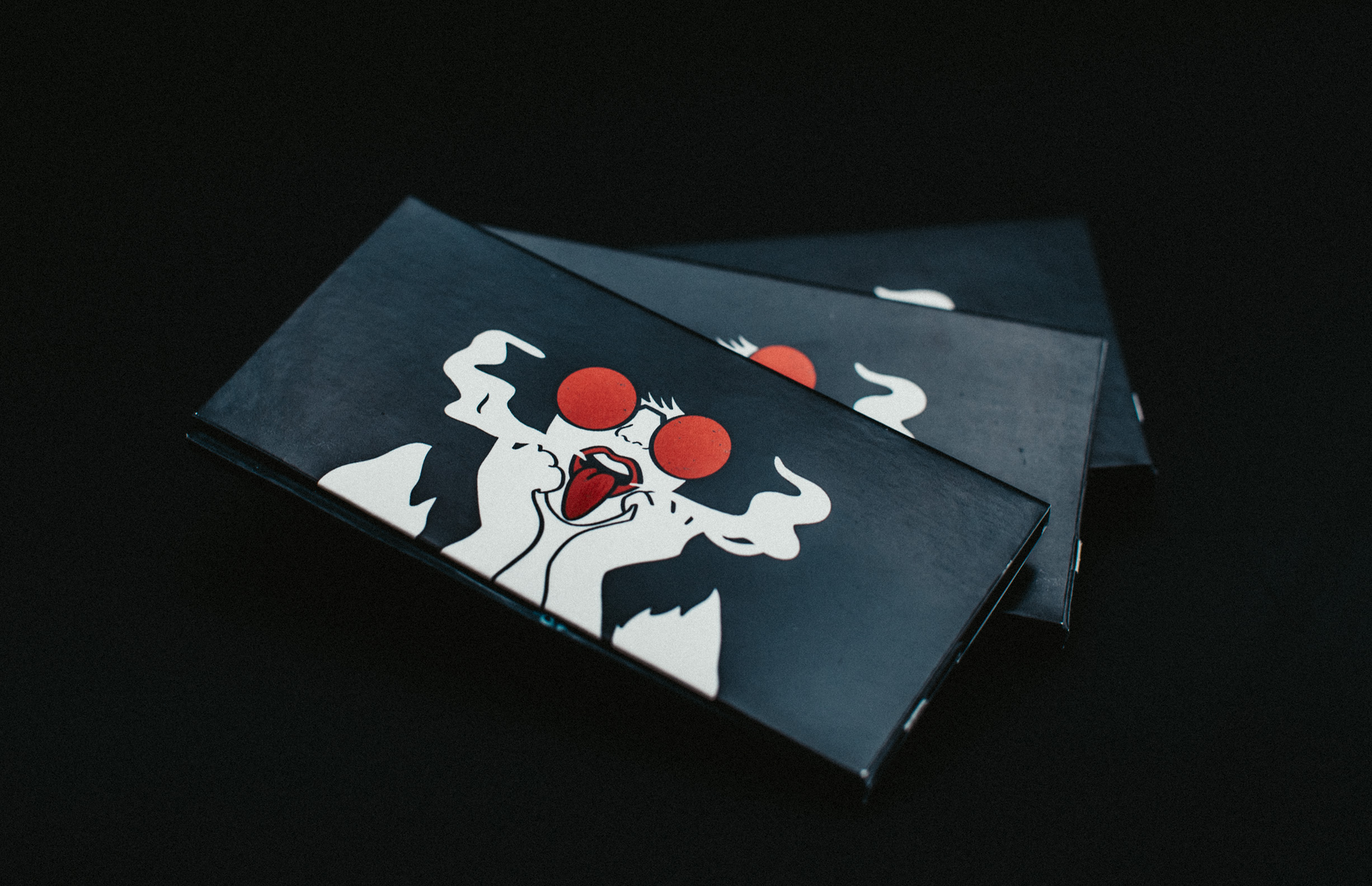
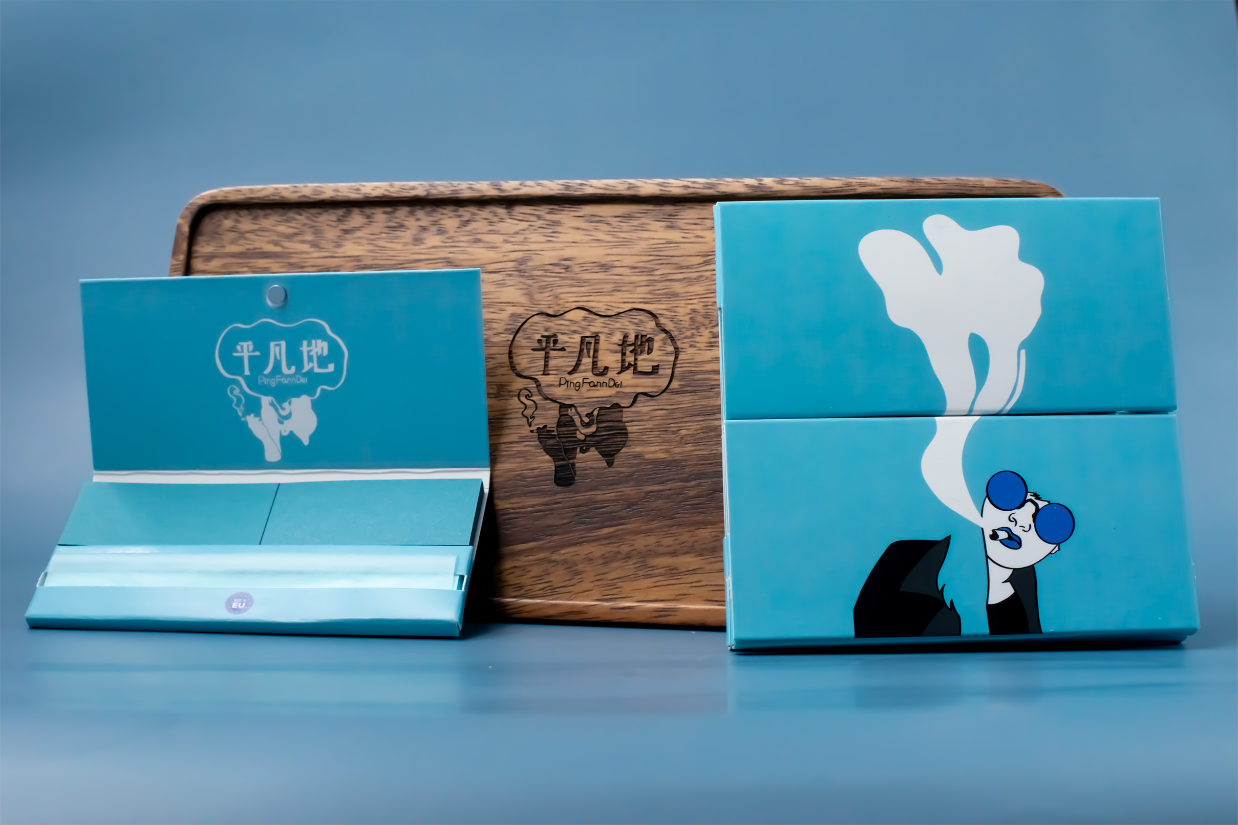
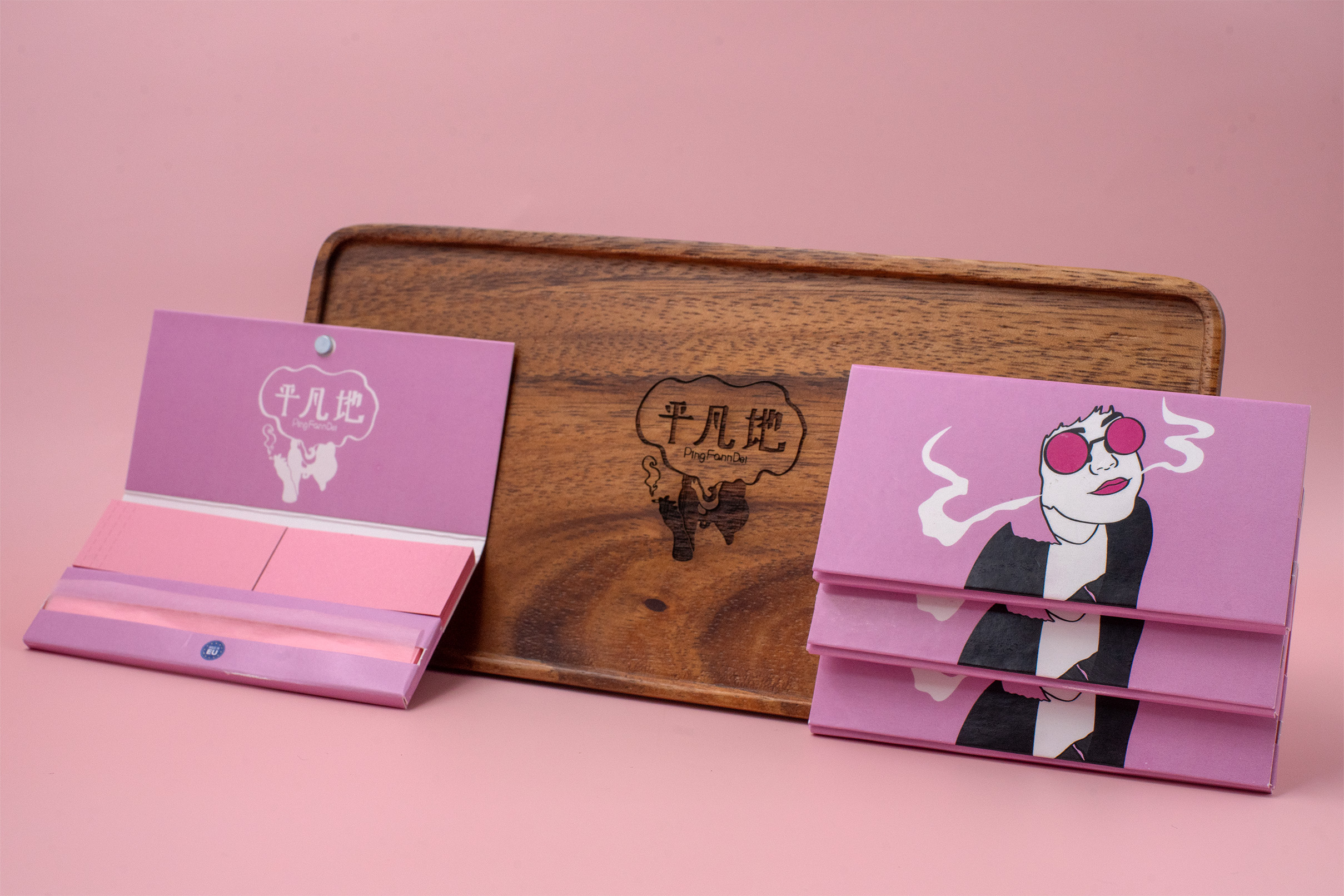
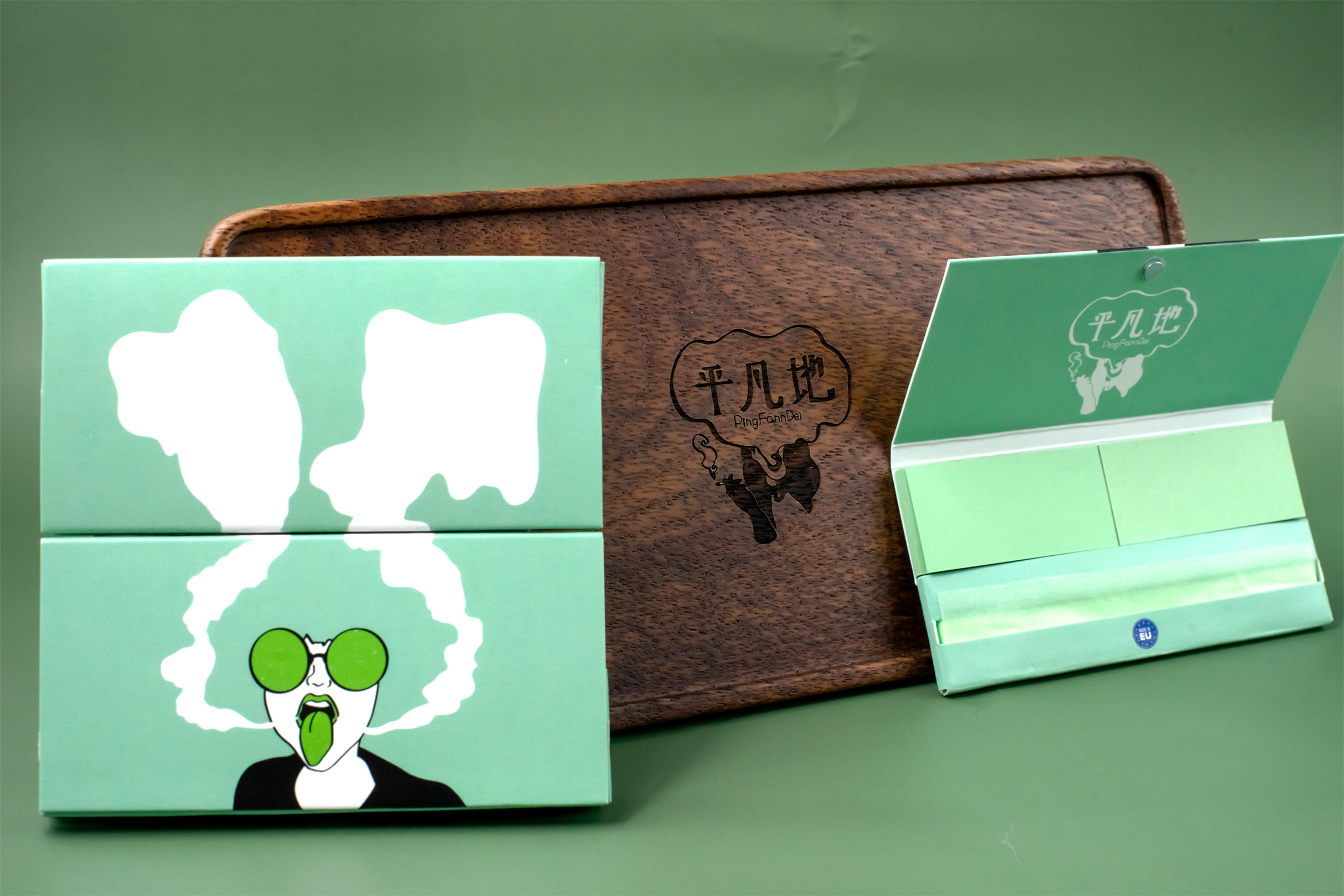
四款女性角色,各有神態與姿態,代表了不被定義的「她」——不甜美、不取悅、不解釋。這次品牌形象設計實驗,將手捲煙紙作為承載語言的媒介,傳遞出一種不迎合、不妥協的視覺能量。
每一款設計都以女性視角出發,拒絕「女人吸煙=壞」這種父權式道德觀。角色的眼神、手勢、衣著、色彩,都說著不同語言,但共享一種核心:我可以怎樣存在,由我決定。
包裝風格簡潔但強烈,主色直接、插畫線條清晰,攝影延伸角色的場域與張力——她們不再是誰的配角,而是主場上的風景、中心與主張。
This series doesn’t promote smoking — it confronts the social coding that surrounds it.
Pingfanndei’s rolling paper project uses bold female characters to subvert the outdated equation of “women + smoking = wrong.” It’s a visual protest. A playful one — but with edge.
Each character is unapologetically herself: not cute, not submissive, not here to explain.
They are drawn with clarity, dressed with intention, posed with a gaze that returns yours. This is identity design as resistance — with paper, ink, and a puff of smoke as its tools.
The photography builds a narrative space for them to live: cinematic, staged, alive. This is not branding to seduce, but to reclaim. The act of holding a cigarette becomes, instead, a symbol of holding one’s space. Entirely, visibly, on her own terms.